Most organizational design decisions are made in the dark, trapped between static slide decks that hide real impact and live HRIS systems where a single accidental “save” can trigger company-wide panic. This “risk gap” forces leadership teams to choose between committing to a restructure too early or debating endlessly over spreadsheets that can’t visualize reporting depth or span of control. This guide explores how scenario planning replaces guesswork with a “digital twin” of your company—allowing you to model complex reorg planning, visualize structural “deltas,” and test every “what-if” in a secure sandbox before making a single official change.
What is a Hierarchical Structure? The hierarchical organizational structure is a traditional model in which authority, responsibility, and communication flow through clearly defined levels, from top management down to individual contributors. Each employee reports to a single supervisor, creating a pyramid-shaped chain of command that supports control and accountability. This structure is one of the most widely used frameworks for organizing teams and business operations.
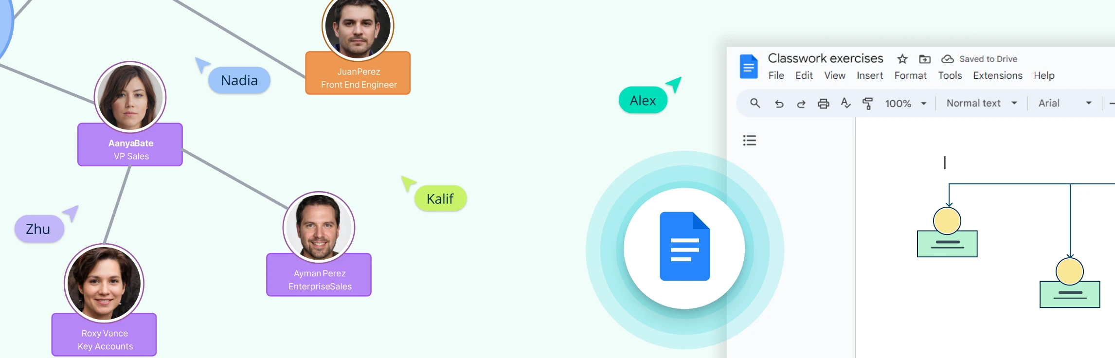
Creating an organizational chart in Google Docs is a handy way to visualize team structures and reporting lines, especially if you’re already working within Google Workspace. While Docs doesn’t have a built-in org chart feature, you can still build one using the Drawing tool with shapes and connectors. In this guide, we’ll walk you through the steps, share tips to make the process easier, highlight the drawbacks of using a Google Doc org chart, and suggest a better alternative for more complex or professional org charts.
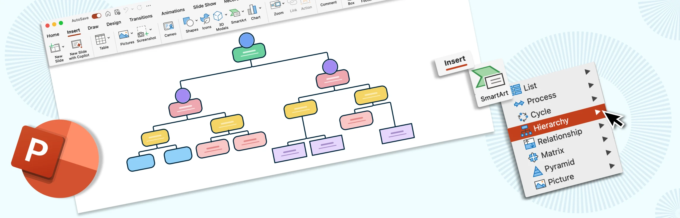
Creating an org chart in PowerPoint is a quick way to visualize reporting lines and align teams right inside your deck. This guide gives you step-by-step instructions on how to build an org chart in Powerpoint, practical layout and formatting tips to keep branches tidy and on brand, and common pitfalls to avoid. You’ll also get a clear view of PowerPoint’s limitations, and why a dedicated tool like Creately is better suited for creating professional organizational charts.
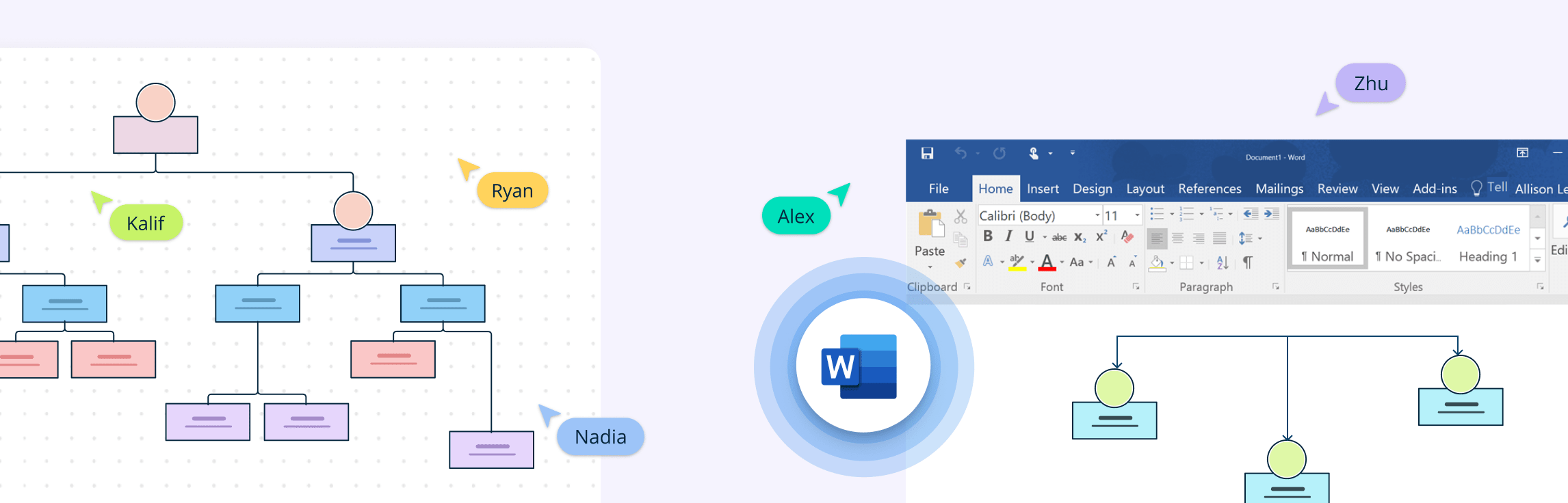
Creating an organizational chart in Microsoft Word is a quick way to visualize reporting structures and team hierarchies without needing specialized software. Whether you’re preparing a presentation, documenting your company structure, or sharing team roles, Word’s built-in SmartArt graphics make it possible to create a simple org chart directly within your document. In this guide, we’ll walk you through the steps, share tips to make the process smoother, point out Word’s limitations, and explore a better alternative if you need more flexibility.
The shift toward data-driven decision-making is reshaping how companies visualize and manage their structures. By integrating real-time insights into organizational charts, businesses can unlock new efficiencies, enhance collaboration, and future-proof their strategies. In this guide, we explore the power of data-linked org charts and how they’re becoming indispensable tools for HR planning, strategy alignment, and organizational growth.
An Excel org chart is a visual representation of an organization’s structure created using Microsoft Excel. It outlines the relationships between different roles, departments, and individuals within a company. In this guide, we’ll show you how to make an org chart in Excel and explore the benefits of using Creately, a tool designed to overcome the challenges Excel presents.
An organization chart is a graphical representation of relationships between an organization’s departments, functions, and people. It can also indicate the flow of data, responsibility, and reporting from bottom-up or top-down. Its usage across the globe is a testament to its effectiveness. Below are some rules for drawing organizational charts and org chart best practices to make your org chart more meaningful and useful.