When a senior leader leaves, spreadsheets and talent notes are not enough. You need clear succession planning metrics that show who is ready, where the gaps are, and which roles carry the most risk.
This guide looks at how to build a dynamic, visual command center that quantifies leadership depth and ensures your organization’s momentum doesn’t stall when the org chart shifts.
What Is Succession Planning for Executives?
At its core, succession planning for executives and key leaders is a proactive strategy to build a high-velocity pipeline of “Ready-Now” talent. While traditional replacement planning is often a reactive scramble, a modern approach uses specific metrics to give you real-time visibility. By moving from static documents to a visual workspace, you can shorten time to readiness and transform a high-stakes guessing game into a clear, actionable roadmap.
Why These KPIs Matter (The “Why” Behind the Dashboard)
Standard HR metrics like turnover tell you what happened in the past. Succession KPIs tell you what’s possible in the future. In fast-changing markets, your leadership data points must address three critical imperatives:
- Risk Mitigation: A “missed readiness” signal in a critical role can lead to significant cultural and strategic disruption. Metrics help you quantify the potential impact against your internal strength.
- Strategic Visibility: You need a secure, visual way for stakeholders to see the pipeline without the noise of administrative data. A clean dashboard helps decision-makers make rapid, informed choices.
- Dynamic Velocity: Roles evolve quickly. Your metrics must be dynamic, tracking how quickly a successor’s progress aligns with the shifting strategic needs of the business.
Why Executive KPIs Differ from Standard Talent Metrics
While standard HR metrics focus on broad workforce trends like turnover and general engagement, succession planning metrics at the leadership level require a more rigorous, high-stakes lens. When tracking the leadership, the data points must move beyond “satisfactory performance” to address three critical business imperatives:
High Financial Stakes
A single executive “missed readiness” or a failed external hire can cost an organization a loss in market capitalization, stalled strategic initiatives, and cultural disruption. Executive KPIs prioritize risk mitigation by quantifying the cost of a vacancy against the strength of the internal pipeline.
Confidentiality vs. Strategic Visibility
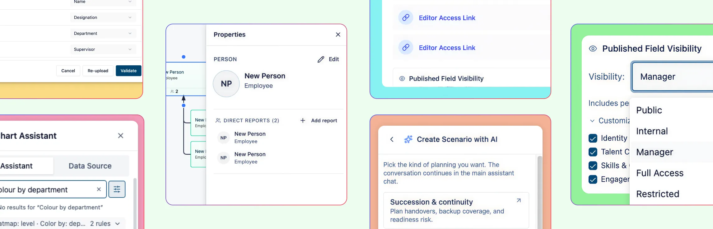
Unlike general talent pools, executive succession requires a delicate balance of extreme discretion and absolute clarity. Modern leaders need a secure, visual command center that provides a high-level overview of the leadership pipeline without the clutter of administrative HRIS data, ensuring stakeholders can make rapid, informed decisions.
Dynamic Velocity
In fast-changing markets, executive roles evolve far faster than entry-level positions. Standard metrics are often too static; executive KPIs must be dynamic, tracking how quickly a successor’s “Time to Readiness” aligns with the shifting strategic needs of the business.
Top 10 Executive KPIs for Succession Planning Dashboards
To move from a reactive “replacement” mindset to a proactive “readiness” strategy, you need to track specific, data-driven KPIs. These metrics provide an objective view of organizational health and the ROI of your leadership development.
Here are the 10 essential metrics to include in your dashboard, standardized for clarity and action.
1. Executive Bench Strength (The “Depth” Metric)
- What it is: The ratio of “Ready-Now” internal candidates (those capable of stepping in today) against “Ready-in-12-Months” candidates.
- Why it matters: It tells you if you have a “spare” for your most critical roles. Without depth, a single resignation becomes an organizational crisis.
- How to calculate it: Divide the number of “Ready-Now” successors by the number of critical roles you are tracking.
- Warning Sign: If you find yourself looking at a 1:1 ratio for a critical seat, you are one departure away from an empty desk.
- Metric Thresholds:
- Healthy: 2:1 or 3:1 ratio.
- At Risk: 1:1 ratio.
- What to do next: Use color-coded “heat maps” in your Succession Org Chart to identify “red” departments and prioritize them for immediate talent development or external sourcing.
2. Time to Readiness (The “Velocity” Metric)
- What it is: The average time required for a High-Potential (HiPo) leader to bridge their competency gaps and become fully prepared for their target role.
- Why it matters: It acts as a “speedometer” for your leadership pipeline, showing whether your development programs are actually moving the needle.
- How to calculate it: Average the projected “gap time” (Target Readiness Date minus Today’s Date) for all identified successors in a specific pool.
- Warning Sign: If the average time to readiness is trending upward over several quarters, your internal coaching is likely hitting a bottleneck.
- Metric Thresholds:
- Healthy: Decreasing or stable timeline aligned with projected retirement/transition dates.
- At Risk: Increasing timeline or readiness dates that exceed the expected vacancy date of the current incumbent.
- What to do next: Map these timelines in a Gantt Chart to visualize development milestones (like cross-functional rotations) and ensure they align with your strategic needs.
3. Critical Role Coverage
- What it is: The percentage of your identified “business-critical” roles that have at least one designated successor.
- Why it matters: It surfaces “blind spots.” You might have great depth in Finance but zero coverage in Operations, creating an uneven risk profile.
- How to calculate it: (Number of critical roles with at least one successor / Total number of critical roles) x 100.
- Warning Sign: Any critical role with 0% coverage is a high-stakes vulnerability that requires immediate attention from the Board.
- Metric Thresholds:
- Healthy: 100% coverage.
- At Risk: Anything below 90% coverage.
- What to do next: Assign a “Risk Score” to every seat in your leadership map to prioritize development resources toward these uncovered areas first.
4. Internal Promotion Rate
- What it is: The percentage of leadership-level vacancies filled by internal talent versus external hires over a specific period.
- Why it matters: It measures the ROI of your talent investments. A healthy rate suggests your culture and development programs are successfully maturing talent.
- How to calculate it: (Internal Hires / Total Hires for critical roles) x 100.
- Warning Sign: A rate near 100% might suggest “insular thinking” or a lack of fresh perspective, while a very low rate suggests your internal development is failing.
- Metric Thresholds:
- Healthy: Often ranges between 60%–80% (allowing for some “fresh blood” from external hires).
- At Risk: Below 40% (indicates a weak internal pipeline).
- What to do next: Compare this against your Bench Strength to see if your “Ready-Now” candidates are actually being selected when the time comes.
5. Diversity Mix
- What it is: The demographic and cognitive diversity of your potential successor pool compared to the broader workforce.
- Why it matters: A resilient pipeline isn’t just deep; it’s broad. It ensures that “high potential” isn’t limited by unconscious bias, which can lead to “leadership cloning.”
- How to calculate it: Track the percentage of successors from underrepresented groups within your total HiPo pool.
- Warning Sign: If your internal promotion rate is high but your diversity mix is stagnant, you may be unintentionally narrowing your leadership perspective.
- Metric Thresholds:
- Healthy: Successor diversity reflects or exceeds the diversity of the mid-level management tier.
- At Risk: Successor pool is significantly less diverse than the overall workforce.
- What to do next: Use a 9-Box Grid to overlay diversity data onto performance potential, ensuring your “Stars” represent a balanced cross-section of your organization.
6. Career Path Ratio (The “Growth” Metric)
- What it is: A numerical value that compares total promotions (vertical moves) against the sum of all role changes (both vertical and lateral).
- Why it matters: It tells you if your talent is actually moving “up” or just moving “around.” A healthy ratio proves that your succession plan is creating upward mobility rather than just filling gaps horizontally.
- How to calculate it: Total Promotions / (Total Promotions + Total Lateral Moves).
- Warning Sign: A ratio below 0.2 suggests a stagnant pipeline where employees are moving sideways but rarely ascending into leadership.
- Metric Thresholds:
- Healthy: 0.7 or higher (signals frequent upward movement).
- At Risk: 0.2 or lower (signals “career plateauing” or a lack of promotion opportunities).
- What to do next: If your ratio is low, audit your 9-Box Grid to see if “High Potential” employees are being overlooked for promotions in favor of external hires.
7. Retention (The “Stability” Metric)
- What it is: The percentage of employees who remain with your organization over a specific period, particularly those identified as high-potential (HiPo) successors.
- Why it matters: Retention is the ultimate “early warning” indicator of organizational health and employee satisfaction. If your successor pool looks like a revolving door, your “Bench Strength” is essentially a fiction, and you’ll find yourself constantly paying the high cost of external recruitment.
- How to calculate it: (Number of employees at the end of a period / Number of employees at the start of the period) x 100. (Focus this specifically on your “Successor Pool” for better insight).
- Warning Sign: A sudden dip in retention among your mid-level managers often signals that your top talent doesn’t see a clear “Time to Readiness” or a path to advancement.
- Metric Thresholds:
- Healthy: 85% or higher (specifically for your identified high-potential talent).
- At Risk: Below 70% (indicates a culture or growth-path issue that will eventually hollow out your leadership pipeline).
- What to do next: If retention is low, conduct “Stay Interviews” with your identified successors. Use a Development Roadmap to visualize their future with the company, ensuring they feel empowered and “seen” as part of the long-term legacy.
8. Flight Risk (The “Loss” Metric)
- What it is: A predictive score—often based on engagement surveys and one-on-ones—that estimates how likely a key successor is to leave the organization within the next six months.
- Why it matters: You can have a deep bench, but if your top successors are unhappy, your “Bench Strength” is an illusion.
- How to calculate it: Qualitatively assessed through manager check-ins or quantitatively via engagement software (scoring factors like pay satisfaction and role changes).
- Warning Sign: A sudden drop in engagement scores or “unwanted changes” in a key successor’s role are immediate indicators of a potential departure.
- Metric Thresholds:
- Healthy: Low risk scores across your top 20% “High Potential” talent.
- At Risk: High risk scores for any “Ready-Now” candidate in a “High Criticality” role.
- What to do next: Initiate “Stay Interviews” with high-risk successors to address pain points like compensation or career growth before they exit.
9. Readiness (The “Gap” Metric)
- What it is: A qualitative and quantitative assessment of how prepared an organization is to fill a vacancy based on the specific skills and experience of the current candidate pool.
- Why it matters: It validates your “Bench Strength.” Having three people on the bench is useless if none of them actually possess the skills required for the 2026 business landscape.
- How to calculate it: Audit the skills and experience of identified successors against the required competencies of the target role.
- Warning Sign: If the average “skills gap” score is staying the same despite training efforts, your development programs aren’t hitting the mark.
- Metric Thresholds:
- Healthy: Average readiness scores increasing year-over-year.
- At Risk: Successors consistently failing to meet “Ready-Now” competency benchmarks.
- What to do next: Link your Readiness metrics to a Development Roadmap in a visual workspace to track exactly which skills are missing and how you’re closing those gaps.
10. Performance Post-Promotion
- What it is: A measurement of the productivity and effectiveness of individuals after they have transitioned into their new leadership roles.
- Why it matters: This is the ultimate “Quality Control” metric for your succession plan. It proves whether your selection and development process actually works.
- How to calculate it: Compare the performance ratings or KPI achievements of the new leader against the standards set for that role after 6 and 12 months.
- Warning Sign: If newly promoted internal leaders are consistently underperforming compared to their previous external counterparts, your “Readiness” criteria are likely too lenient.
- Metric Thresholds:
- Healthy: New leaders meeting or exceeding 90% of role KPIs within their first year.
- At Risk: High failure or turnover rates within the first 12–18 months post-promotion.
- What to do next: Review your Succession Operating Cadence to see if your “Month 1 Calibration” needs to include more rigorous performance data to better predict success.
Succession Planning Best Practices for the Leadership
For modern leadership teams, succession planning must transition from a static, annual compliance exercise into a dynamic, strategic pulse. To ensure long-term organizational resilience, adopt these high-level best practices as part of your standard operating rhythm.
1. Establish a Quarterly Calibration Cycle
The shelf-life of talent data is shorter than ever. Best-in-class organizations treat their succession plan as a “living” document. Instead of an annual “set-and-forget” meeting, schedule a 60-minute Quarterly Talent Review.
- The Action: The CEO and CHRO perform “pulse checks” on your core metrics.
- The Goal: Ensure the leadership pipeline stays aligned with shifting market conditions, pivot development plans for “at-risk” roles, and update readiness dates in real-time.
2. Adopt a Standardized Visualization Framework
Subjectivity is the enemy of a robust pipeline. To remove “gut-feel” bias, utilize a 9-Box Grid to visualize performance versus potential across the leadership tier.
- The Action: Plot your potential successors on the grid during each quarterly review.
- The Goal: Create a common language for leadership depth. This ensures that “High-Potential” designations are backed by consistent, observable data that everyone on the Board can agree on.
3. Solve for “Future-State” Competencies
Succession planning shouldn’t just solve for today’s job descriptions; it must solve for the roles the company will need in three to five years.
- The Action: Audit your “Time to Readiness” metrics against emerging competencies—such as AI fluency, ESG leadership, or digital transformation.
- The Goal: Ensure your future leaders are prepared for the 2026 business landscape, not just the 2020 version of their current roles.
4. Centralize into a Single Source of Truth
Fragmented data spread across disparate PDFs and slide decks leads to “analysis paralysis.” You need a secure, visual command center where all talent maps and KPIs live.
- The Action: Move your succession maps into a collaborative, visual workspace (like Creately) that links directly to your talent data.
- The Goal: Ensure all decision-makers are looking at the same real-time “Risk Map,” accelerating the speed of calibration and reducing the friction of administrative updates.
Succession Planning Dashboard Templates to Visualize Key Metrics
To effectively manage succession planning metrics, executive teams must move beyond lists and spreadsheets. Visual frameworks allow you to process complex talent data at a glance, turning abstract KPIs into a clear roadmap for leadership continuity.
The following diagrams are essential for a modern, high-stakes succession strategy:
1. The 9-Box Grid (The Talent Calibration Standard)
The 9-Box Grid is the gold standard for visualizing the relationship between an executive’s current performance and their future potential. It categorizes leaders into nine distinct segments, allowing you to quickly identify “Stars” (high potential/high performance) versus those who may require more targeted development. This is the primary tool for determining Bench Strength and identifying who is “Ready-Now.”


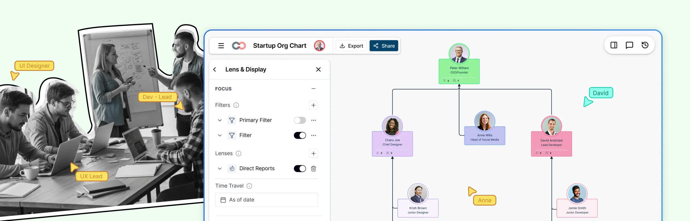
2. Dynamic Succession Org Charts (The Risk Map)
Unlike a standard administrative chart, a Succession Org Chart is a functional risk map. By linking real-time data to each role, these charts use color-coding to highlight Role Criticality and Vulnerability. For example, a “red” box indicates a critical role with no immediate successor, while “green” indicates a deep bench of 2:1 or higher.

3. Time to Readiness Gantt Charts (The Velocity Timeline)
A Gantt Chart or timeline view is the most effective way to track the Time to Readiness for the next generation of leaders. It maps out specific development milestones—such as cross-functional rotations or executive coaching—against a target transition date.
- The Metric Connection: This visualizes the “Velocity” of your pipeline, showing exactly when a High-Potential leader will be ready to step up.

Effective succession planning marks the transition from reactive “replacement” to long-term organizational resilience. While clear metrics give you peace of mind, it is the power of visual clarity that converts that data into strategic action.
Ready to transform your executive talent data into a clear, actionable roadmap? Try Creately today and build a leadership core that is ready for whatever comes next.
Helpful Resources for Succession Planning
Understand the fundamentals of succession planning and why it matters.
Learn how to build an effective succession plan step by step.
Explore proven best practices for building leadership continuity.
Learn how to assess performance and potential using the 9-box grid.