Compensation decisions carry significant weight, yet the information needed to make them is often fragmented across spreadsheets, reports, and disconnected systems. When pay data lacks organizational context, identifying inequities, inconsistencies, or misalignment with market benchmarks becomes time‑consuming and error‑prone. This guide explores how compensation analysis can be made more effective by connecting pay data directly to org charts—providing a clearer view of how compensation is distributed across roles, teams, and reporting lines, and enabling faster, more confident decision‑making.
What Is Compensation Analysis?
Compensation analysis is the systematic evaluation of employee pay across an organization to ensure it is equitable, competitive with market benchmarks, and aligned with business strategy and budgetary guidelines. It involves analyzing compensation components such as base salary, pay ranges, and total rewards to understand how compensation is distributed across roles, levels, departments, and locations, and to support informed, data‑driven pay decisions.
Why Visualizing Compensation on an Org Chart Changes Everything
Compensation data is most meaningful when viewed in context. While spreadsheets present pay information in isolated rows, org charts reveal the relationships and structures that shape how compensation is distributed across the organization. Many compensation challenges emerge not at the individual level, but across reporting lines, job levels, and departments.
When you visualize compensation directly on an org chart, you can:
- See pay distribution across reporting lines, not isolated rows
- Visualize equity gaps, using color‑codes instead of formulas
- Identify problem clusters (entire teams under‑market, not just individuals)
- Explain insights to leadership clearly, without sharing raw salary numbers
Visual indicators, such as color‑based heatmaps, further simplify analysis by highlighting compensation ranges at a glance—red for under‑market, green for at‑market, and blue for over‑market—without requiring detailed calculations. This visual approach enables clearer communication with leadership, supports faster decision‑making, and provides a more intuitive way to understand compensation dynamics across the organization.
How to Do a Compensation Analysis in Creately
Creately enables teams to conduct compensation assessment within a single, visual workspace—eliminating the need to move between spreadsheets, reports, and presentation tools. The workflow below outlines how compensation data can be analyzed directly on an org chart, from setup to scenario planning.
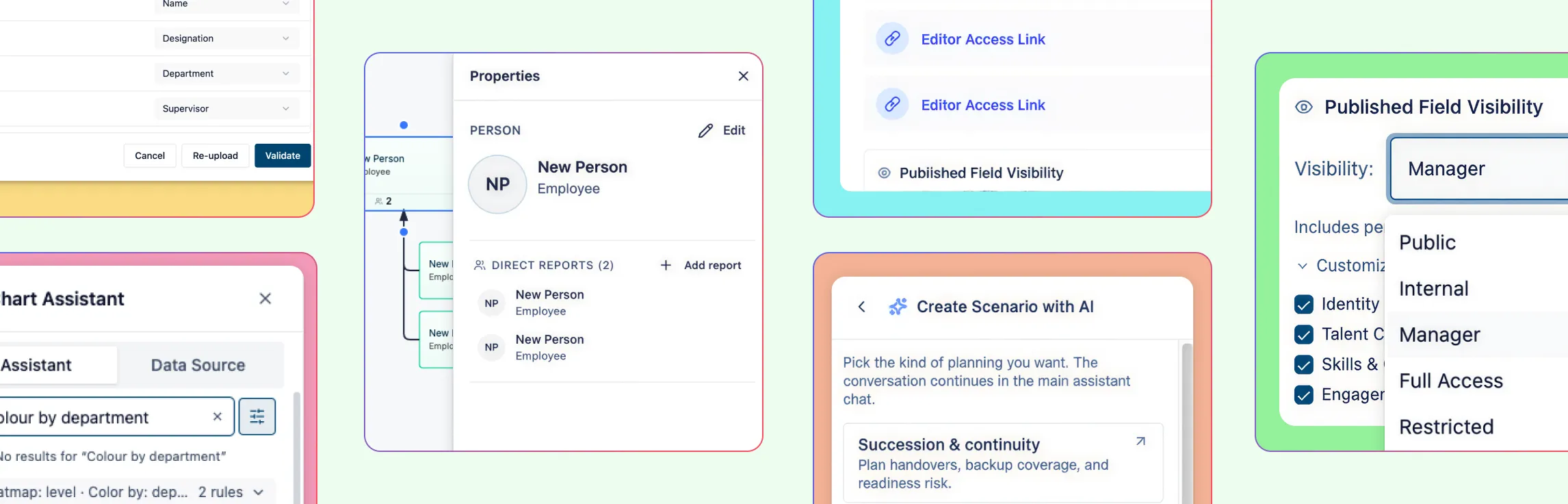
Step 1: Activate the Compensation Field Pack
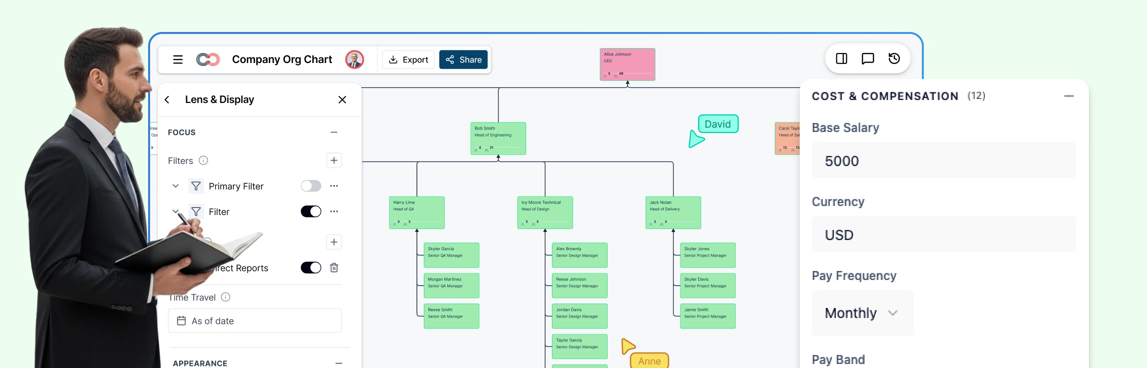
Begin by enabling the Compensation Field Pack for your org chart. This adds standardized compensation fields—such as base salary, compa‑ratio, pay grade, bonus percentage, and equity—to each employee record. These fields are integrated directly into the org chart, ensuring compensation data remains tied to roles, reporting lines, and organizational structure.
Step 2: Import Compensation Data via CSV
Upload compensation data from your HRIS or payroll system using a CSV file. Creately’s AI automatically maps spreadsheet columns to the appropriate compensation fields, reducing manual setup and formatting. Before completing the import, validation checks flag missing or inconsistent data so issues can be addressed upfront.
Step 3: Apply Sensitivity Controls
Configure visibility using Creately’s multi‑tier sensitivity model. Compensation data can be restricted to HR leadership by setting visibility to Tier 4 or higher, ensuring managers and individual contributors cannot see sensitive fields. This allows teams to collaborate on the org chart while maintaining strict data confidentiality.
Step 4: Apply Compa‑Ratio Heatmaps
Use heatmaps to visualize compensation alignment across the organization. Compa‑ratio values are automatically represented through color‑based indicators:
- Below 0.8 highlights under‑market compensation
- 0.8–1.2 indicates at‑market pay
- Above 1.2 flags potential over‑market situations
This makes it easy to assess compensation health across teams and reporting lines at a glance.
Step 5: Filter and Segment the Org Chart
Apply filters to narrow analysis by department, job level, location, or employment type. Segmenting the org chart helps identify patterns such as compression within teams, inconsistencies across regions, or misalignment at specific levels—insights that are difficult to surface in static reports.
Step 6: Use AI to Query Compensation Data
Leverage natural language queries to surface specific insights without manual filtering. For example, asking “Show me employees with a compa‑ratio below 0.85 in Engineering” instantly highlights the relevant individuals directly on the org chart, accelerating analysis and review discussions.
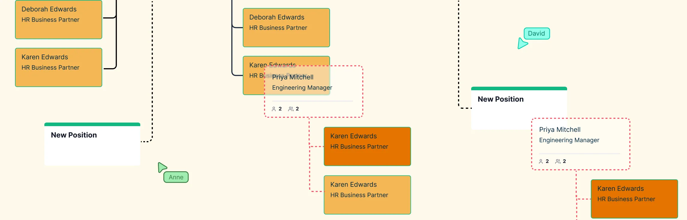
Step 7: Model Adjustments Using Scenarios
Create scenario branches to model compensation changes such as merit increases, market corrections, or budget‑constrained adjustments. Scenarios allow teams to evaluate outcomes and compare options without modifying live compensation data, supporting more confident and informed decision‑making.
Key Compensation Metrics Explained
Compensation metrics provide the foundation for informed pay decisions, but they should be straightforward to interpret and apply. The following metrics are commonly used in compensation analysis and become significantly more actionable when viewed in organizational context.
Compa‑Ratio
Compa‑ratio compares an employee’s actual pay to the market midpoint for their role. It is calculated by dividing current salary by the midpoint of the pay range and is commonly used to assess whether compensation is below, aligned with, or above market expectations.
Range Penetration
Range penetration indicates where an employee’s compensation falls within their assigned pay band. This metric helps assess internal progression, identify potential compression issues, and support promotion or development planning.
Pay Equity Ratio
The pay equity ratio compares compensation across demographic groups while accounting for factors such as role, level, and location. It is commonly used to identify disparities and support fair pay practices.
Total Compensation
Total compensation represents the complete reward package, including base salary, bonuses, equity, and benefits. Evaluating total compensation provides a more accurate view of employee value than base pay alone.
When these metrics are visualized on an org chart, they move beyond isolated figures and reveal patterns across teams, levels, and reporting structures, enabling clearer analysis and more confident decision‑making.
Org Chart Templates to Get Started


Pay Equity Audit Workflow Made Practical
Pay equity analysis require accuracy, consistency, and clear context. Challenges often arise when compensation data is fragmented across multiple systems, making it difficult to evaluate pay fairly and efficiently. An org‑based approach brings compensation data, organizational structure, and employee attributes into a single view, allowing equity analysis to be conducted in a more systematic and transparent way.
With org‑chart‑based a compensation analysis report, audits become visual and actionable:
- Compare pay across genders and demographics
- Normalize comparisons within the same job grades
- Adjust for geography and cost of living
- Identify systemic gaps through visual clustering, not endless reports
Instead of exporting charts for every question, you can explore equity issues live, with confidence and control.
Creately vs Other Compensation Analysis Tools
| Feature | Creately | ChartHop | Payscale | Excel |
|---|---|---|---|---|
| Compensation on org chart | ✓ | ✓ | ✗ | ✗ |
| Compa‑ratio heatmaps | ✓ | ✓ | ✓ | Manual |
| Sensitivity controls | 6‑tier | Role‑based | N/A | None |
| Scenario modeling | ✓ | ✓ | ✗ | Manual |
| AI queries | ✓ | ✗ | ✗ | ✗ |
| Price | $5/employee/year | $8/employee/month | Custom | Free with Microsoft 365 |
Creately combines visual compensation analysis, scenario modeling, and AI‑driven insights in a single workspace, while remaining accessible in both cost and usability. Unlike tools that require separate systems for analysis, presentation, and planning, Creately enables teams to work directly from a live org chart—supporting faster analysis, clearer communication, and more informed compensation decisions without unnecessary complexity.
Secure Compensation Data with Creately’s 6‑Tier Sensitivity Model
Compensation data analysis requires more than basic access restrictions; it requires precise control over visibility. Creately’s 6‑tier sensitivity model allows organizations to define exactly which compensation fields are visible at each level, ensuring sensitive information is accessible only to the appropriate stakeholders.
For example, CHROs can be granted full visibility into compensation details, HR leaders can access ratios and pay bands without viewing exact values, and managers or individual contributors can be restricted from seeing compensation data entirely. This approach enables teams to collaborate, present insights, and analyze compensation within a shared org chart while maintaining confidentiality, reducing risk, and preserving trust across the organization.
Effective compensation analysis requires clarity, context, and control. Throughout this guide, we’ve covered how visualizing compensation on an org chart helps surface meaningful patterns, how key metrics like compa‑ratio and pay equity can be analyzed more effectively, and how secure, scenario‑based workflows support informed pay decisions. By bringing compensation data, organizational structure, and analysis tools into a single workspace, Creately enables teams to move from fragmented reviews to actionable insight.
Try Creately to see how compensation analysis can be simpler, more transparent, and better aligned with the way modern teams work.
Helpful Resources
Build, analyze, and plan org structures with Creately’s workforce planning tool.
Explore what is workforce planning with dynamic org charts.
Learn how to plan organizational restructures using scenario planning.
Easily make organizational charts to visualize the reporting structure of your organization for effective HR planning and management with org chart maker.
Learn simple steps to create an org chart that fits your business, along with tips and tools to make it easy to build and update.
Explore rules for drawing organizational charts and org chart best practices to make your org chart more meaningful and useful.