Table Chart Maker
Discover Useful Insights Faster
Create visually stunning table charts to organize your information and data with Creately’s table creator. Arrange your data in meaningful ways and interact with them to make effective data-driven decisions.
Templates
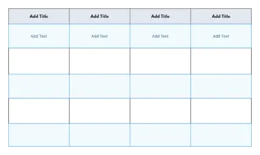
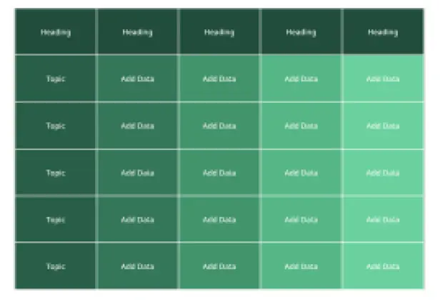
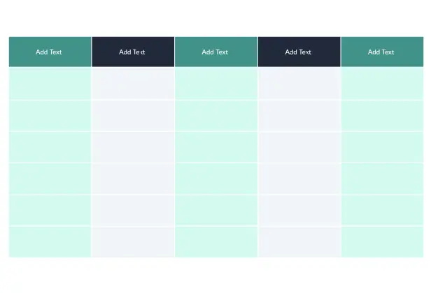
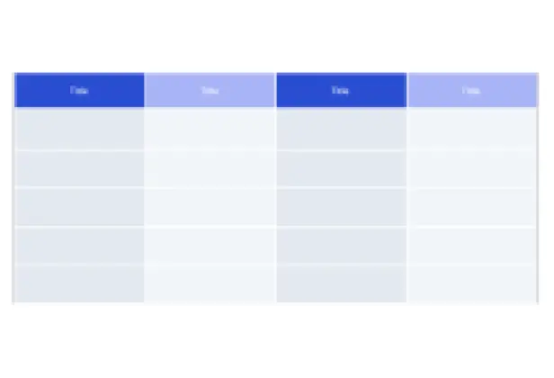
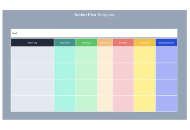
Table Chart Templates
Table Chart Templates


Intuitive table shape with advanced customizability
Import data as CSV and Excel files or spreadsheets
Real-time visual collaboration to work with teams


 Diagramming Visual Collaboration Org Chart


How to make a Table Chart?
How to Collaboratively Create a Table Chart with Creately
Open a Workspace
Open a workspace in Creately’s table maker and add your peers as collaborators with edit access allowing them to work on the table chart with you in real-time. This sets the stage for seamless collaboration and centralizes all edits in one visual space.
Gather Data
Gather the information you need. Open the relevant CSV or Spreadsheet to be imported. Ensure the data is well-organized to avoid issues during table creation.
Select a Table Chart Template
Select a table chart template from the template library in Creately’s table chart generator or draw one from scratch using Creately’s extensive shape library.
Customize Your Table Chart and Add Data
Style your table chart using the shape settings and add key data for each element on the table using the data panel as necessary. Use font styles, background colors, and icons to highlight trends, patterns, or categories.
Invite Collaborators to Contribute
Share the table chart with reviewers, editors, or viewers or invite them to a real-time video conference while making the edits. Everyone can co-edit and provide input simultaneously using multi-cursors and live presence indicators.
Finalize the Table Chart
Find the changes that the collaborators made via the multi-cursors on the canvas in real-time or via the version history. In case you want to revert to a previous iteration, select the version to apply the changes.
Collect Feedback
Gather feedback and discuss with Creately’s in-line commenting. You can tag specific collaborators, link to data references, or attach files for richer context.
Export the Chart
Once finalized, use Google/Microsoft add-ons, embed in an email, website, or export the table chart in various formats including CSV, SVG, PDF, PNG, and many more with Creately’s table maker online.
Intuitive Table Chart Maker to Visualize Your Data Effortlessly

Powerful and versatile table with precision control and advanced customizability.
Format the table with different colors, font styles, & borders to highlight data patterns.
50+ types of diagrams with extensive shape & icon libraries to visualize any type of data.
Multiple professionally-designed table chart templates for a variety of scenarios.

Organize Data Across Multiple Sources with Our Online Table Maker
Multiple app integrations with two-way sync to help you import and export data.
Migrate data in CSV or Excel files or spreadsheets to visualize on the canvas.
Add detailed docs, attachments, links and more with integrated notes.
Built-in tools to quickly organize your visuals and create interactive presentations.
Collaborative Table Chart Generator to Keep Everyone & Everything in Sync

Real-time cursors for any number of participants to collaborate on a shared canvas.
Comment with context, have discussions and follow-ups on the same canvas. Async!
Multiple access & role levels to share, review, and edit your data.
Full version history to keep track of key points during each iteration of your data entry.
What is a Table Chart Maker?

When Can Teams Collaboratively Use a Table Maker to Organize & Gather Information?
Here are a few ways a team can use a table chart maker to collaboratively organize information:
- Tracking tasks:
A team can use a table chart to track tasks and their status. The table can include columns for task name, assigned team member, due date, and status (e.g., not started, in progress, completed). This can help to ensure that everyone is aware of their responsibilities and the status of each task.
- Comparing data:
A table chart maker can be used to compare data from different sources. For example, a team can create a table with columns for data from different time periods or locations, allowing them to easily compare and analyze the data.
- Budgeting:
A table chart maker can be used to create and manage a budget. The table can include columns for budget categories, actual and projected expenses, and notes on any budget changes or concerns.
- Decision-making:
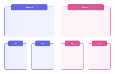
A table chart maker can also be used to facilitate decision-making. The team can create a table with columns for each option being considered, along with relevant criteria and a rating system for each option. This approach can help to ensure that decisions are made based on objective criteria rather than personal opinions.
- Project management:
A table chart maker can be a powerful tool for project management. The team can create a table with columns for project milestones, assigned team members, due dates, and status. This approach can help to ensure that the project is progressing as planned and that everyone is aware of their responsibilities.
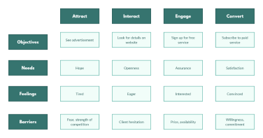
Make a TableVisualize Data in Minutes with these Premade Table Chart Templates
FAQs About the Table Chart Maker
What are Creately’s table chart maker pricing plans?
- Free Plan — $0/month for basic table chart creation and collaboration
- Starter & Team Plans — $8/month or $5/month billed annually
- Business Plan — $149/month or $89/month billed annually
Annual billing helps you save more while unlocking advanced collaboration, workspace management, and enhanced table chart features. You can compare all available plans and features on the Creately Pricing Page.
How can you create table charts faster?
Are there templates for different table chart use cases?
Can teams collaborate on table charts?
Can I add notes, data, and files?
Can I share, present, or export table charts?