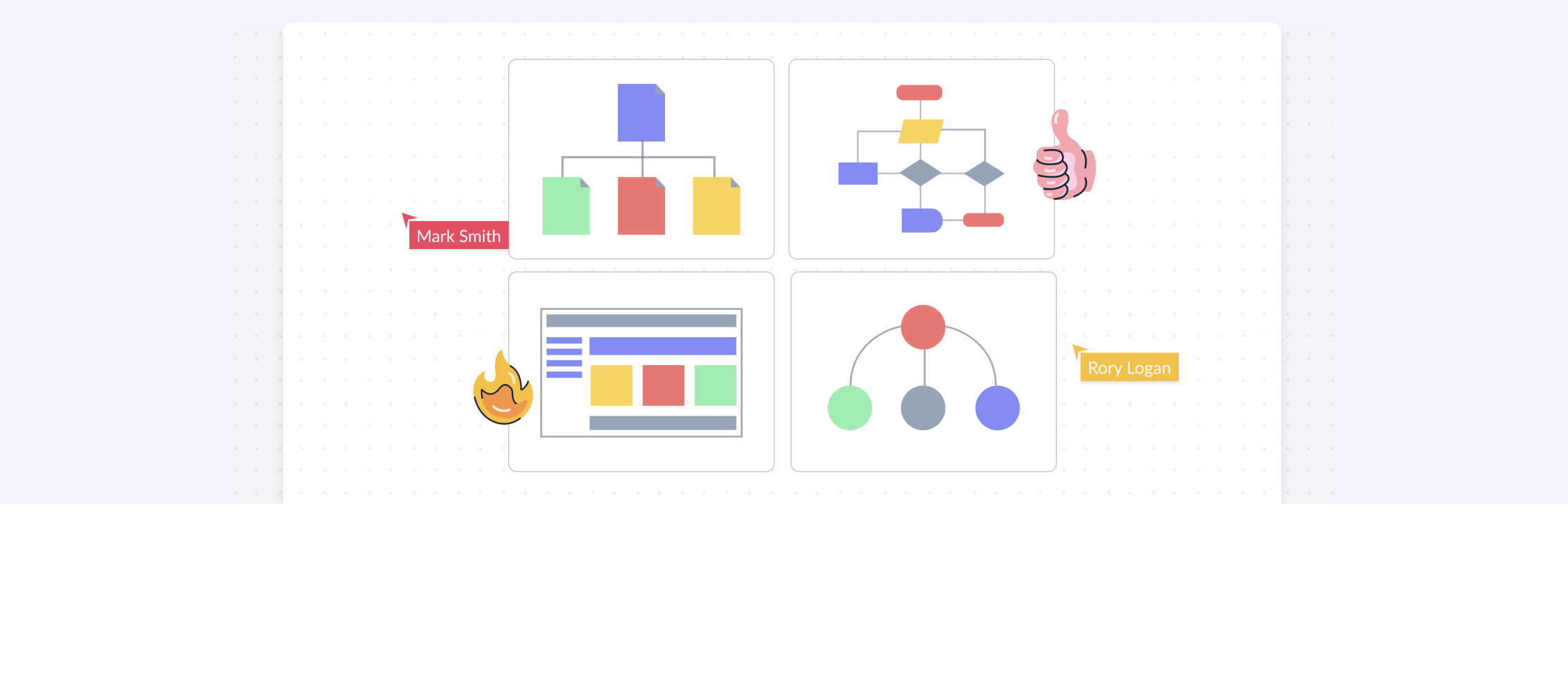
Most people assume that to build a great website, your priority should be on technical aspects or being good at the design stuff. However, we disagree.
Great websites are not built on a whim. They are planned and then built (and frequently updated).
So this guide will help you set you up for success with your new website by giving you a solid plan to start with. You can give this to an external developer/agency or use it as an internal reference if your own team is working on it. Regardless of how you execute, website planning will make everything better.
If you want a document to fill out and then present, we have downloadable Word and Google Docs files which include some great Creately templates.
Get the website planning templates here;
Download the Word Document Template
Phase 1: Pre Website Planning
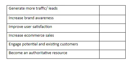
Determine Your Website Objectives
A clear business objective is the first step towards creating a successful website.
Whether it is to generate more leads or sell your product in foreign markets, once you know what you want to do with the website, everything else – from the type of information you should add on your site to its design – will be so much easier to decide.
So first of all, list down your objectives that will fit your overall marketing strategies and capabilities.
Analyze the Websites of Your Top Competitors and Market Trends
Once launched, your website won’t be the only one out there selling or promoting the type of product you’ve got.
This is why you need to see what’s already out there and compare them with what you have in mind.
- Look into the websites of your competitors and other industry websites as well. They will not only inspire you but will also give you an idea as to what you should and shouldn’t include on the website.
- Examine what trends are leading your market at the time. This will help you create a website that is both relevant and useful to your potential customers.
Use the following mind map to organize the information you collect on the websites of your top competitors and market trends. Share it with your team and get their input as well.
Bringing all this into a single mind map gives you the chance to spot patterns and understand the space in a different sense.

Phase 2: Information Architecture and User Flows
Organize Information with Information Architecture
This is where you consider what the user expects to see and the content you want users to associate with each section of the website.
Information architecture helps you determine the usability of your website design – or in other words, make sense of how information on your site is displayed and accessed.
Learn how to properly create an information architecture of your website in six steps here.
Define Your Website’s Structure Using a Site Map
In layman’s terms website map is a tool for planning and designing websites. Visualizing your website using a sitemap (also known as a site architecture map) is a decisive step because it helps in creating coherent navigation paths for users to follow through the website. With this framework in place, you can think logically understand and consider how your users will navigate through the site, then tailor content to them.
Sketch your sitemap
Use a sitemap drawing tool or plain pen and paper to sketch your sitemap out. Using standard sheets of paper may not be enough to accommodate all your design thoughts and ideas, so you have to preferably use more paper or to keep it simple, just use a sitemap tool to get this job done. And keep the design layouts organized in folders online or on your local disk instead of wasting time looking around for papers you know you have somewhere.
Use a clean layout
What is the best layout to illustrate your website’s structure? Start by drawing a page icon in the middle, this will represent the homepage. From there, more page icons will branch out horizontally to indicate other pages within the website. Within minutes, you will have the horizontal diagrammatic representation of the structure of your website in the top-down structure.
Color to create a visual treat
Color up the shapes on your sitemap structure to produce unmatched levels of aesthetics delivering a unique visual treat and bringing the entire sitemap to life. You can give the homepage one color and each of the subsequent sections can be shaded differently to show the hierarchy of pages.
Style all the navigation links
Each Web page in the sitemap is represented as a page icon. Navigation links (connectors) are used to connect the page icons to illustrate the relationships that exist between the pages. These connectors can be either straight, curved, or sharp-angled. See the image below to understand how each of these connector styles affects the overall look of the sitemap.
Suggest URLs for each page
The importance of a web page’s URL structure is always a debated topic. SEO experts consider placing keywords in the URLs important. Thus, suggesting URLs in the page icons will help clients understand the intended URL structure as a part of the interface.
Create links to test your framework
You are definitely happy that the framework is ready to be sent for review. But it’s always best to test the framework by linking the individual page icon to the respective wireframes of mockups to show the client a clear view of the overall web design project. This will save a lot of time and effort and also help your clients evaluate the functionality and consistency of the existing sitemap structure.
Use the following sitemap template to get started on yours.

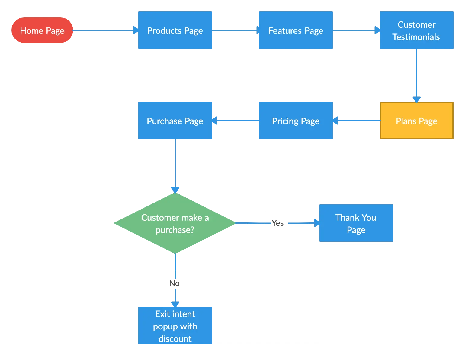
Identify the Navigation Flow of Your Visitor
This is where you dig into the data (that you found while creating the information architecture of your site) on information-seeking behavior of your audience and try to uncover a pattern in it.
Using a flowchart, you can map and identify all the pages and touchpoints your ideal visitor would interact with when navigating through your website. User flow is how you figure out what you need to give (in the form of phrases, paragraphs or images) to your visitor to keep them from bouncing off your site.
Phase 3: Design Layouts and Site Infrastructure
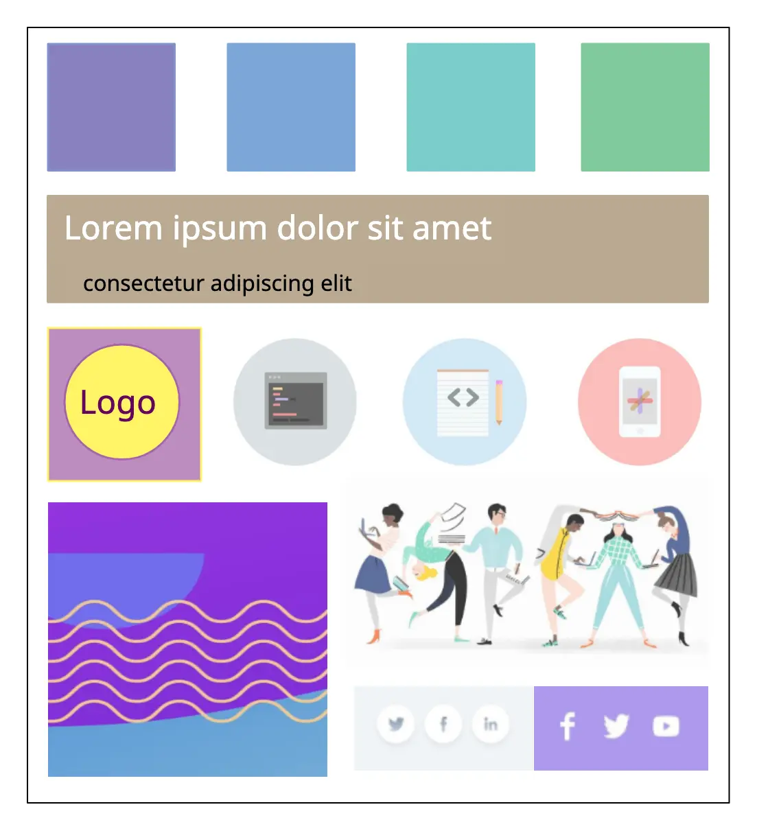
Identify Key Colors, Elements and Styles with a Mood Board
A mood board can help you create a website look that matches your brand personality which includes your brand voice and brand style.
A usual website mood board should cover
- color palette
- photography or illustration style
- fonts/ typography
- use of space
- navigation style
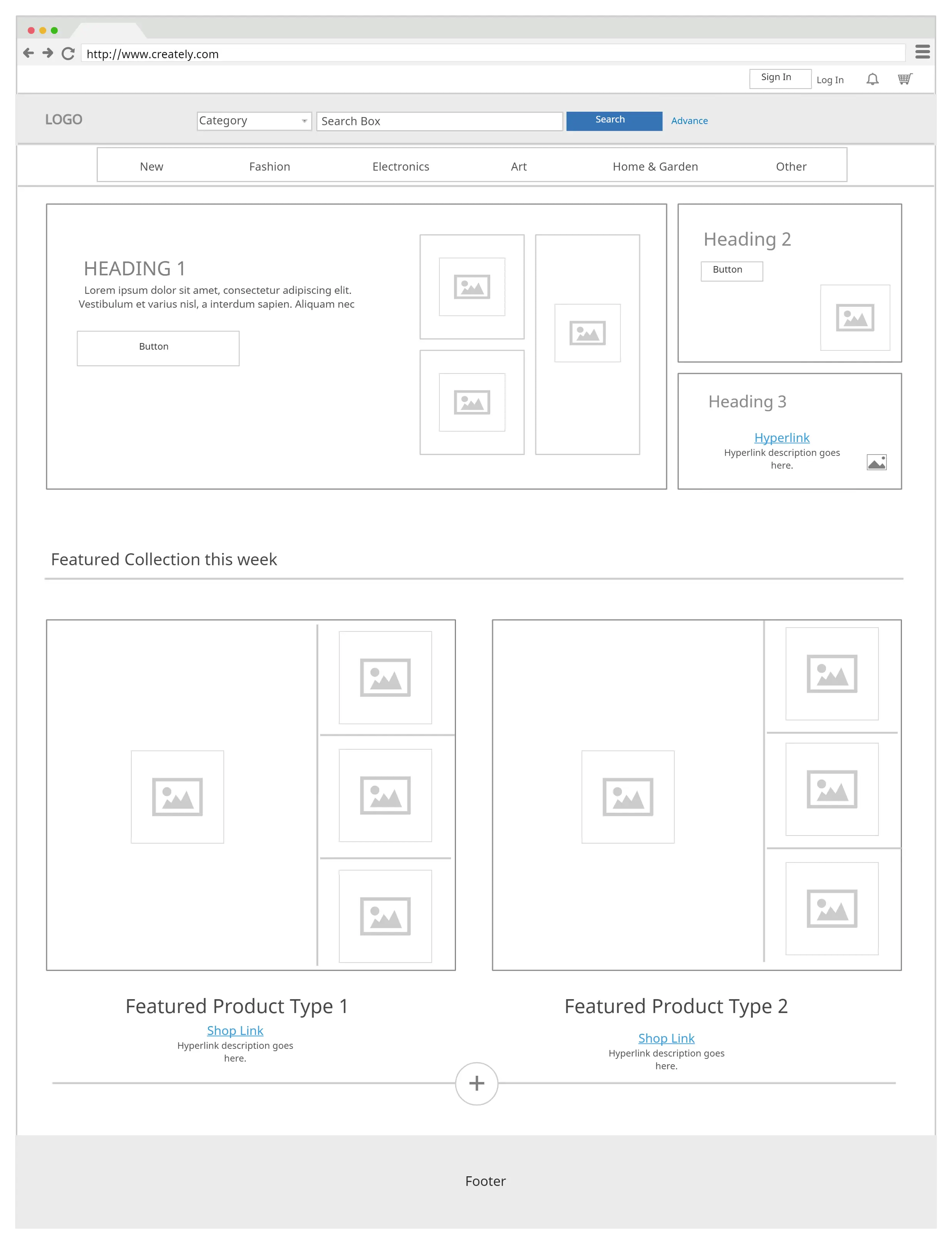
Arrange Page Elements with Wireframes
Wireframes help you define the hierarchy of content on your design. By referring to the information architecture you created earlier, form the layout of the website pages with the help of a wireframe .
Keep in mind how you want your site visitors to process information when doing so.
It’s also the first step in figuring out how each page on the website is linked to each other.
Tip: Start with wireframes for smaller screens and start your way up. It’s the only hassle-free way to create a responsive website design.
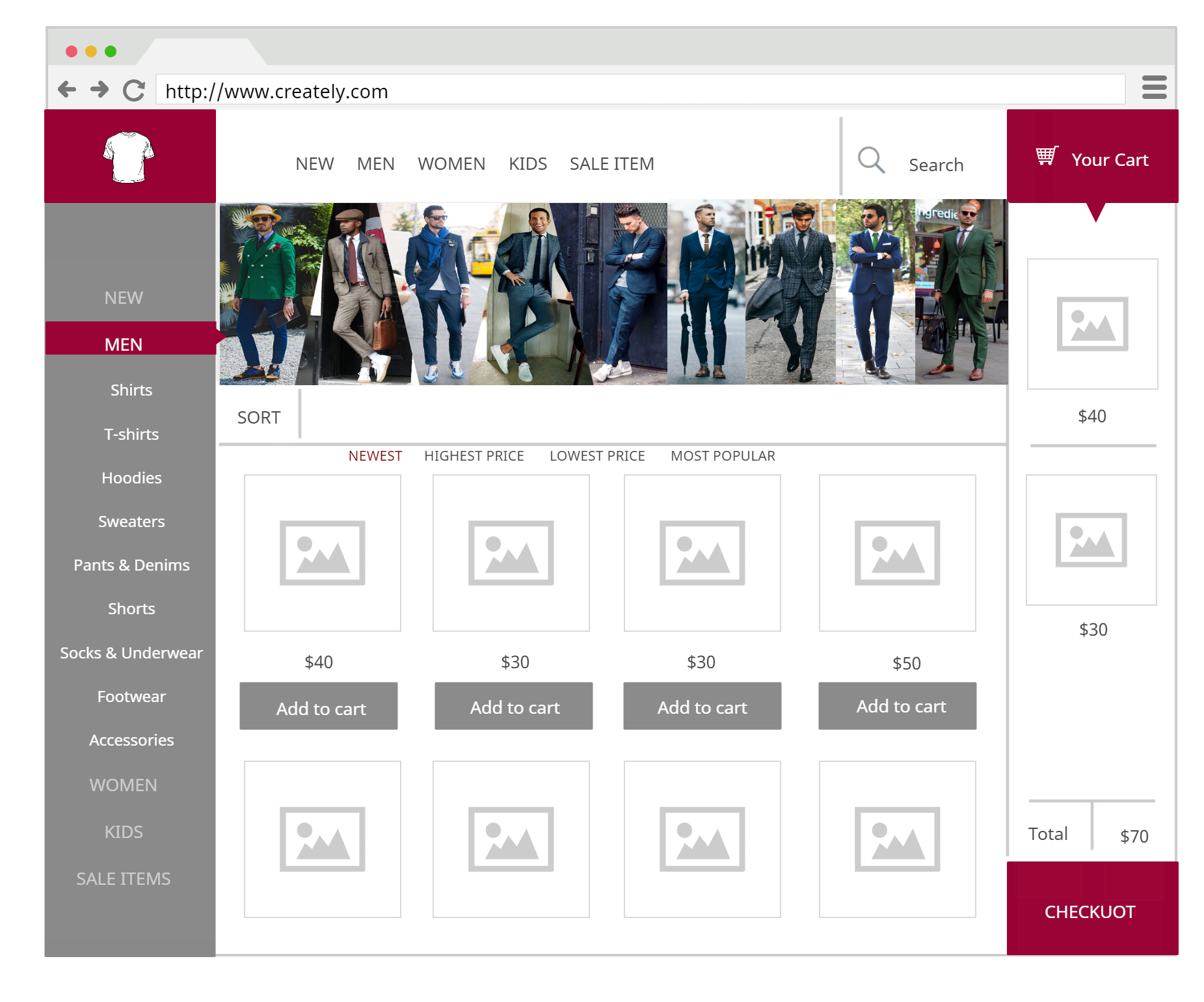
Finalize the Design with UI Mockups
UI mockups allow you to identify issues with your final design before you launch the website. With it, you can flesh out your wireframe and visualize the final outcome of typography, iconography, color themes, layouts and navigation.
Phase 4: Promotion and Marketing
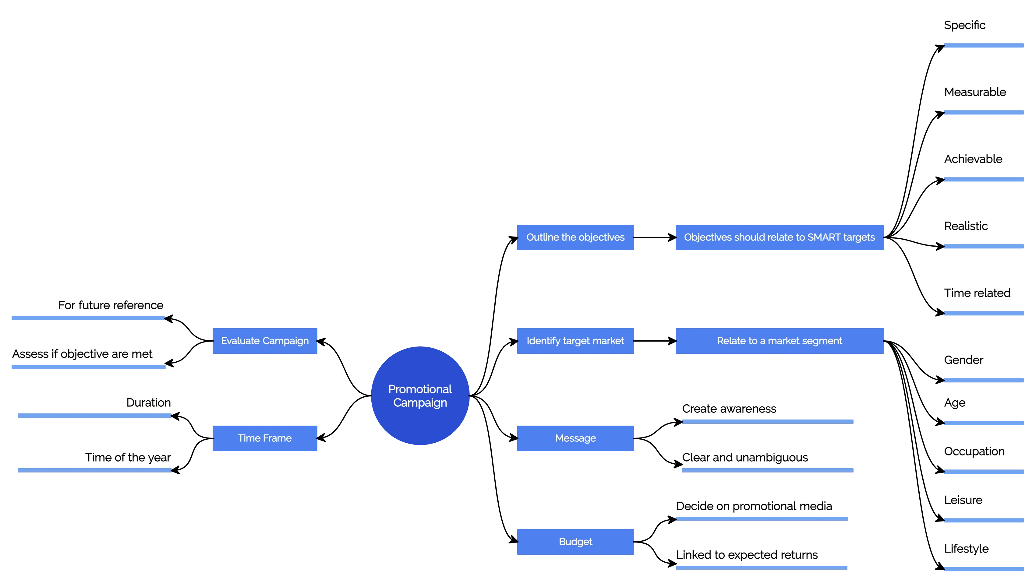
Brainstorm Ideas for Promoting Your Site
Once the site is launched, you need to attract visitors to it. This is where site promotion comes in and it involves many tasks like search engine optimization (SEO), social media marketing, targeted advertising etc.
Get your marketing team together and brainstorm different ways to market and promote your new website. A mind map can help you organize all your ideas and come up with a proper marketing strategy.
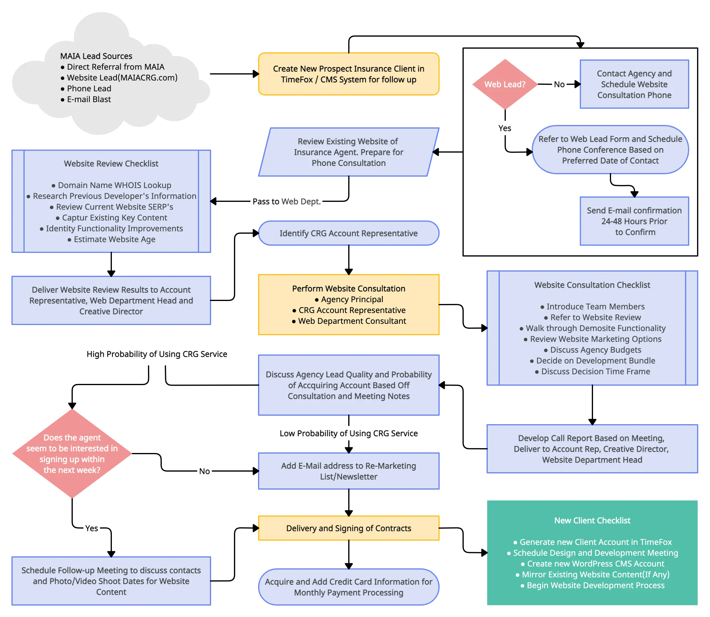
Website Development Flowchart
Common Mistakes to Avoid when Planning a Website
Lack of clear goals
Define clear goals and objectives before starting to plan your website. This will help you make accurate decisions about design, content, and functionality that align with your goals.
Failing to consider user experience
A website should be designed with the user in mind. Consider how visitors will interact with the website and make it easy for them to find what they are looking for.
Ignoring Search Engine Optimization
It’s essential to optimize the content of your website for search engines in order it to be found by potential customers. Therefore make sure you use relevant keywords, include meta tags, and use proper headings.
Overcomplicating design
Simple and clean designs are often more effective than cluttered ones. Avoid adding too many unnecessary elements or features that can overwhelm users.
Not testing and updating
After launching your website, make sure to regularly test and update it. This will help you identify and fix any issues or bugs and keep your website up-to-date with the latest trends and technologies.
Ready to Plan Your Website?
We’ve covered planning a website in 8 easy steps under 4 different stages of website planning. Use our website planning template to get started right away.
Would like to add something to our website planning guide? Let us know in the comment section below.
And if you are ready for the next stage of your marketing plan, here’s a handy guide to mobile app planning.
Want to increase traffic to your website? Here are 7 easy steps to increase traffic to your website .


