Overwhelmed by messy brainstorm notes or conflicting feedback? That’s where an affinity diagram comes in. In this guide, you’ll learn what is an affinity diagram, and the steps to create one from scratch to improve collaboration and decision-making. We’ll also walk you through real-world examples, and free templates so you can start organizing your thoughts more strategically.
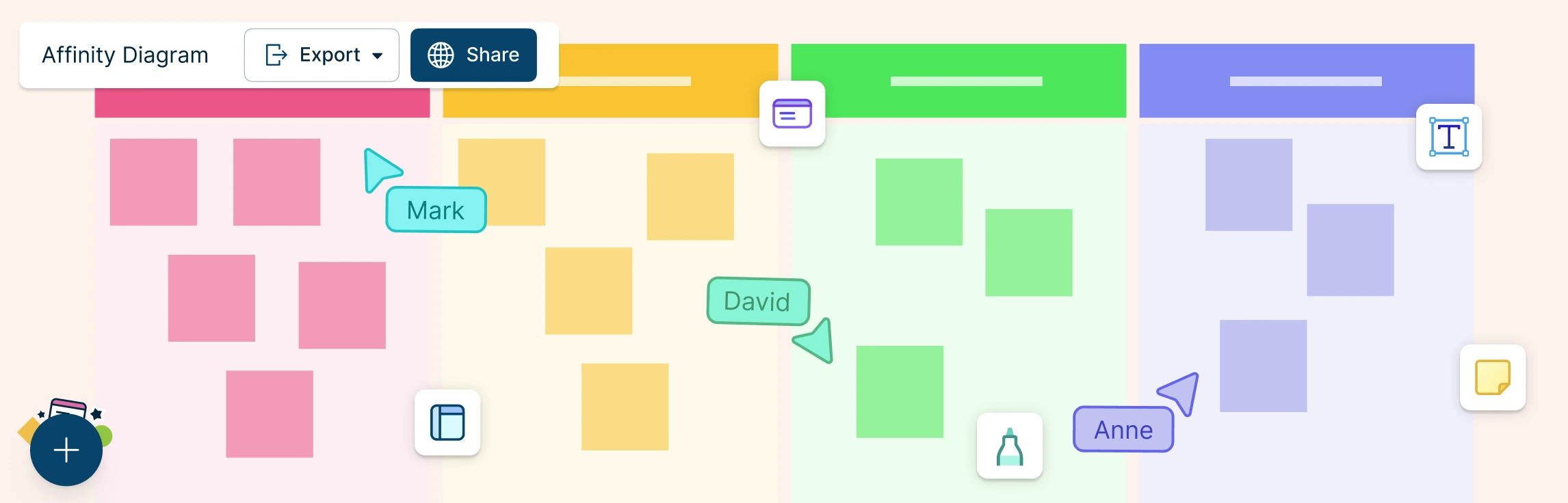
What Is Affinity Mapping? Affinity mapping—also known as affinity diagramming—is a powerful technique for synthesizing large volumes of qualitative data into actionable insights. Used in UX research, design thinking, agile retrospectives, and customer feedback analysis, this method transforms sticky notes and scattered ideas into structured themes that fuel innovation.
Affinity mapping in UX brings structure to qualitative research, transforming raw observations into cohesive themes. It fuels actionable insights by clustering related observations, ideas, or pain points. This guide walks through core concepts, workflows, and tools, from basic affinity diagram UX to best practices.
In project management, especially within the PMP® methodology, organizing stakeholder input, requirements, and risks is critical for effective planning. An affinity diagram in PMP helps project managers visually cluster large volumes of qualitative data, revealing natural relationships and guiding strategic decisions.
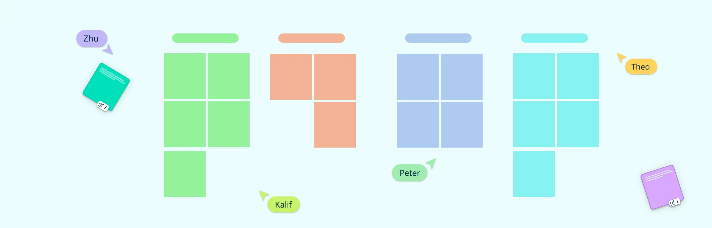
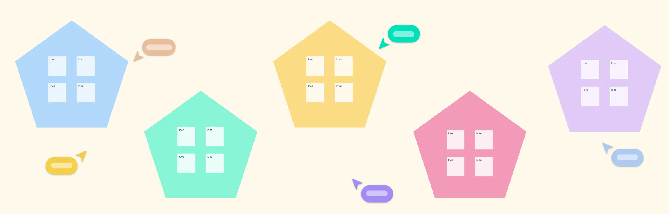
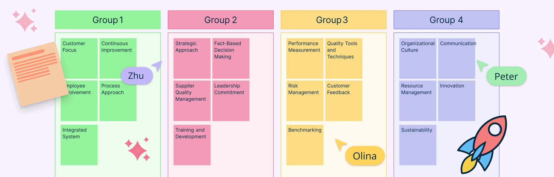
When teams are flooded with ideas, data, or feedback, it’s easy to lose clarity. That’s where Affinity Diagram Examples come in handy. These visual tools help you organize information into logical groups, making it easier to identify patterns, prioritize tasks, and drive decisions.