There is no formal distinction between the terms ‘Empathy Chart’ and ‘Empathy Map’ and the two are often used interchangeably for user research. Empathy map is the standard, well-defined framework, while empathy chart is not officially recognized. We’ll go through each, and look at a breakdown of their differences to help you understand how to use them in practice.
What is an Empathy Chart
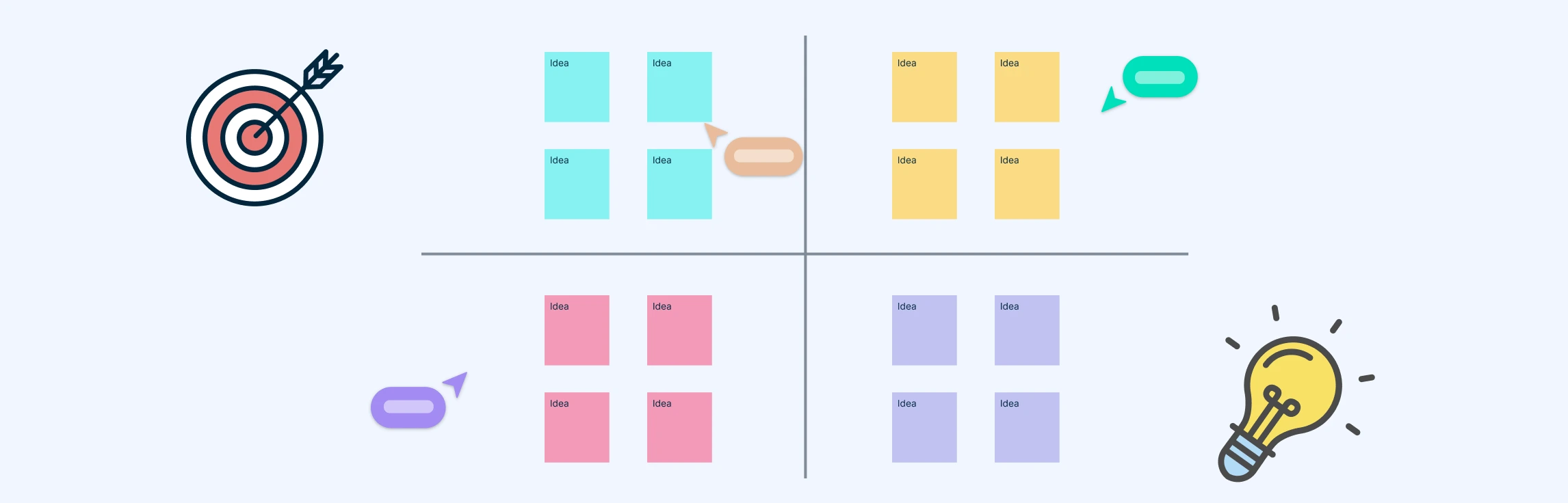
An empathy chart is a simple and linear tool to visualize emotional states alongside user metrics. Its layout supports columns for emotions, pain points, and motivations. Teams can use empathy charts for rapid analysis, concise reporting, and stakeholder alignment.
- Emotions: Frustrated, Curious, Confident, Overwhelmed, Motivated
- Pain Points: Complex setup, Limited insights, Inconsistent support, Feature overload, Team misalignment
- Motivations: Quick onboarding, Data-driven decisions, Reliable documentation


What is an Empathy Map
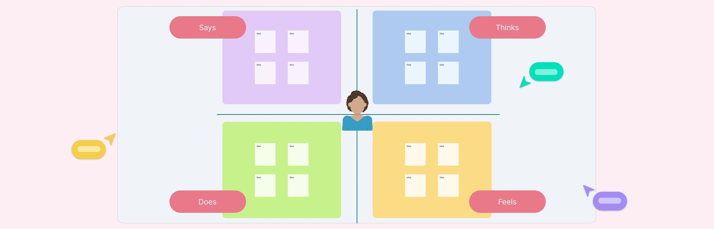
An empathy map presents a quadrant-based canvas that captures a holistic view of user experience. It segments findings into four key areas: what users say, think, do, and feel. By combining direct quotes with inferred motivations, empathy maps encourage a 360-degree exploration of user behavior and mindset.
- Say: Verbatim feedback and common phrases collected during interviews.
- Think: Underlying beliefs, concerns, and mental models driving behavior.
- Do: Observable actions, workflows, and usage patterns.
- Feel: Emotions and attitudes associated with specific interactions.

Key Differences Between Empathy Charts and Empathy Maps
Choosing between an empathy chart and an empathy map depends on project goals, timeline, and desired depth of insight.
Aspect | Empathy Chart | Empathy Map |
Usage of term | Less formal; sometimes used as a synonym for Empathy Map | Widely used standard framework in design thinking and UX research |
Structure | Customizable table or linear grid | Standard 4 to 6 quadrants (Says, Thinks, Does, Feels, optional Pains/Gains) |
Purpose | Often used to visualize or summarize empathy-related findings | To build deep understanding of a specific user or persona |
Depth | High-level emotional summary | Detailed say, think, do, feel insights |
Flexibility | Adaptable metrics and columns | Standardized sections, less layout variation |
Use Contexts | Rapid analysis, stakeholder workshops | In-depth user research, persona creation |
In summary, an empathy chart uses a customizable table to highlight emotions, pain points, and motivations at a glance. An empathy map relies on a standardized framework with say, think, do, feel quadrants for a comprehensive behavioral snapshot.
When to Use Empathy Chart vs Empathy Map
Empathy charts and empathy maps each offer distinct advantages. Teams should select the empathy tool that best aligns with project scope and research depth.
- If you’re doing user-centered design, use an Empathy Map—it’s the industry standard.
- If you’re summarizing emotional/behavioral insights in a flexible way (e.g., in presentations or executive briefs), an Empathy Chart may be a better term to use.

How to Create an Empathy Chart in Creately
Step 1: Define Scope and Objectives
Start by clearly identifying the user segment you want to focus on. This could be a specific demographic, behavioral group, or users of a particular product. Alongside this, establish the desired emotional metrics you want to measure, such as satisfaction, frustration, or excitement.
Step 2: Creating the Empathy Chart
Use Creately’s customizable empathy chart template with the three labeled columns—Emotions, Pain Points, and Motivations to organize user data clearly. Adjust rows or sections as needed for different personas or scenarios.
Step 3: Gathering User Data
Import or manually add qualitative and quantitative insights directly into your Creately workspace. Create dedicated note sections or use linked cards to store interview quotes, survey responses, and behavioral metrics. Organize these inputs visually for quick reference.
Step 4: Populating the Chart
Drag and drop sticky notes or shapes into the empathy chart layout. Add emotional states, pain points, and motivations into the labeled sections. Use different colors or tags to represent various personas, segments, or user stages.
Step 5: Analyze Patterns with Your Team
Invite collaborators to your chart by clicking the ‘Share’ button in the top-right corner of the Creately workspace, then assign view or edit permissions via email or shared link. Highlight recurring themes by clustering related notes or using connectors to group similar insights. Add annotations or visual markers to emphasize high-impact areas. Use the commenting feature to collaborate on key findings with your team.
Step 6: Sharing and Iterating
Present the chart live using presentation mode or export it as an image (PNG, JPEG, SVG and PDF) for stakeholder review. Enable shared access for feedback, use version history to track changes, and refine the chart collaboratively for deeper user understanding.
How to Create an Empathy Map in Creately
Step 1: Define Your Persona or User Segment
Identify the specific user, customer, or persona you’re mapping. Include demographics, role, behaviors, or context relevant to the product or experience.
Step 2: Gather User Data
Collect qualitative data such as user interviews, observation notes, support tickets, and survey responses. Proper data gathering gives you authentic insights into what users say, think, feel, and do when you create an empathy map.
Step 3: Select a Template and Fill the quadrants
Select a suitable template from Creately’s ready-to-use empathy map templates, and start filling in what users say, think, do, and feel based on collected data. Add sticky notes or bullets under each quadrant using real data. Use different colors or tags to differentiate between users, data sources, or research sessions. You can even select a template with Pains and Gains sections for deeper analysis.
Step 4: Synthesize Insights
Identify recurring themes, contradictions, or behavior patterns across the map. In Creately, you can use connectors or arrows to link related insights across quadrants. Highlight key takeaways by adding annotation boxes beside clusters.
Step 5: Using the AI Empathy Map Template
You can also skip all the steps up to now by selecting Creately’s AI empathy map template, which can auto-generate a structured map based on your user research input. This saves time while ensuring insights are visually and correctly organized.
Step 6: Invite Team to Review
Invite collaborators to contribute by tagging them in comments, assigning review tasks, or co-editing the map in real time on the Creately workspace. This will ensure a shared understanding of user needs and collective validation of insights.
Step 7: Share and Iterate
During meetings, use presentation mode to showcase your empathy map and gather feedback via comments. Update notes, reorganize sections, or add insights as needed. Use version history to track changes and easily revert if necessary.
Free Empathy Map Templates By Creately


Helpful Resources for Making Empathy Maps
A practical guide to understanding how an empathy map can help businesses.
Learn how using our empathy map canvas can help understand your customers better.
Use this AI-powered tool to speed up your empathy map analysis.
FAQs about Empathy Charts
Who benefits from empathy maps?
When should you use an empathy chart?
What data sources do I need for an empathy chart?
Can I Customize an Empathy Chart?
Resources
Ferreira, Bruna, et al. “Eliciting Requirements Using Personas and Empathy Map to Enhance the User Experience.” IEEE Xplore, 1 Sept. 2015, ieeexplore.ieee.org/abstract/document/7328012.
Higuera, Marta, and José Antonio Macías. Automatic Generation of Empathy Maps. 4 Sept. 2023, https://doi.org/10.1145/3612783.3612802. Accessed 7 June 2024.
Neubauer, Daniel, et al. “Experiencing Technology Enabled Empathy Mapping.” The Design Journal, vol. 20, no. sup1, 28 July 2017, pp. S4683–S4689, https://doi.org/10.1080/14606925.2017.1352966.